The ANOVA model we have introduced is identical to a regression model with categorical variables, it is just parameterised differently. So why the different names and emphasis on variance - ANalysis Of VAriance? A well designed experiment allows us to estimate the within-treatment variability and between treatment variability. More specifically, it enables the partitioning of the total sum of squares into independent parts, one for each factor in the model (treatment and/or blocking factors). This allows us unambiguously to estimate the variability in the response contributed by each factor and the experimental error variance! We can then use this partitioning to perform hypothesis tests. In other words: by looking at the variation we can find out if the response differs due to the treatments.
An ANOVA applied to a single factor CRD is called a one-way ANOVA or between-subjects ANOVA or an independent factor ANOVA. It is a generalization of the ‘two-sample t-test assuming equal variances’ to the case of more than two populations.
7.1 An Intuitive Explanation
Before we consider real data, we first want to look at a constructed example to explain the main ideas behind ANOVA. Assume that we carried out two experiments on plants removing nitrate (NO\(_3\)) from storm water. In both experiments, we consider three plant species (un-creatively called ‘A’, ‘B’, and ‘C’). In both experiments, we have three replicates per treatment. We are only interested in comparing the species so there is no control treatment. We obtained the following data:
Table 7.1: Hypothetical Experiment
(a) Experiment 1
Species
A
B
C
40
48
58
42
50
62
38
52
60
Average
40
50
60
(b) Experiment 2
Species
A
B
C
40
65
45
25
35
75
55
50
60
Average
40
50
60
If you look at these data sets carefully, you will see that each of the three species had the same mean in the two experiments. However, the measurements were much more variable in Experiment 2 than in Experiment 1.
Which experiment has better evidence that the true mean NO\(_3\) removal rate differs between species? Pause and think about this before reading on.
Intuitively, we would say that Experiment 1 shows much stronger evidence for a true effect than Experiment 2. Why? Both experiments show the same differences among the treatment (species) means. So the variability in the treatment means is the same. However, the variability among the observations within treatments differs between the two experiments. In Experiment 1, the variability within treatments is much less than the variability among treatments. In Experiment 2, the variability within treatments is about the same as the variability among treatments.
The basic idea of ANOVA relies on the ratio of the among-treatment-means variation to the within-treatment variation. This is the F-ratio. The F-ratio can be thought of as a signal-to-noise ratio:
Large ratios imply the signal (difference among the means) is large relative to the noise (variation within groups), providing evidence of a difference in the means.
Small ratios imply the signal (difference among the means) is small relative to the noise, indicating no evidence that the means differ.
7.2 The F-test
When we take the ratio of two variances, it can be shown that the ratio follows an F-distribution with degrees of freedom equal to those of the two variances.
So, for example, say we want to compare the variability between two independent groups, each with normally distributed observations. We define the test statistic as the ratio of the two sample variances:
\[
F = \frac{s_1^2}{s_2^2}
\]
where \(s_1^2\) and \(s_2^2\) are the sample variances of the two groups. The resulting statistic follows an F-distribution with degrees of freedom:
\(df_1 = n_1 - 1\) for the numerator (corresponding to variance \(s_1^2\))
\(df_2 = n_2 - 1\) for the denominator (corresponding to variance \(s_2^2\))
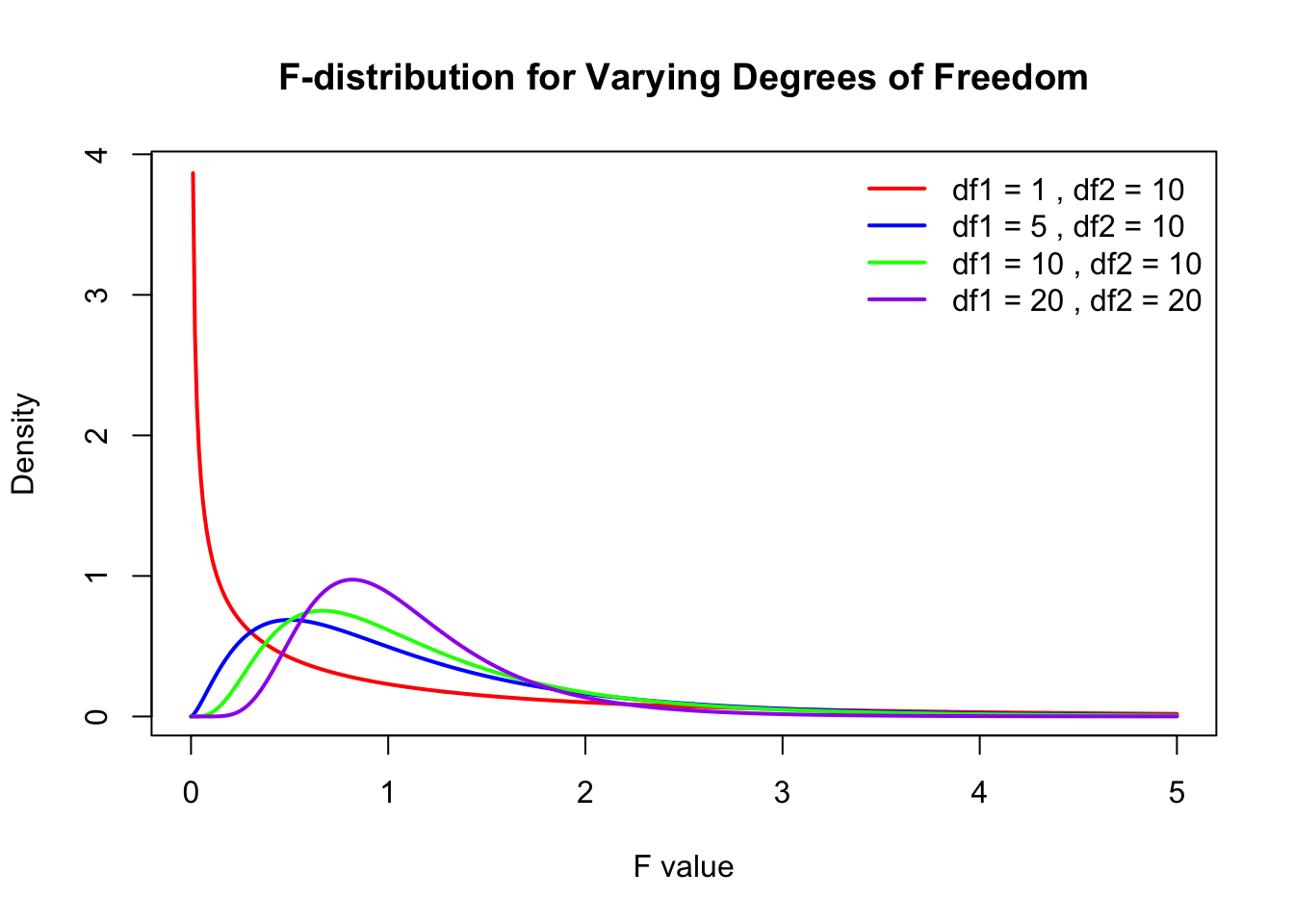
The F-distribution is a probability distribution that arises frequently, particularly in ANOVA and regression analysis.
Code
# Define the range of F-valuesx <-seq(0, 5, length.out =500)# Define degrees of freedom pairsdf_pairs <-list(c(1, 10),c(5, 10),c(10, 10),c(20, 20))# Define colors for different linescolors <-c("red", "blue", "green", "purple")# Create an empty plotplot(x, df(x, df_pairs[[1]][1], df_pairs[[1]][2]), type="n",xlab="F value", ylab="Density",main="F-distribution for Varying Degrees of Freedom")# Loop through df pairs and add linesfor (i inseq_along(df_pairs)) {lines(x, df(x, df_pairs[[i]][1], df_pairs[[i]][2]), col=colors[i], lwd=2)}# Add a legendlegend("topright", legend=paste("df1 =", sapply(df_pairs, `[[`, 1), ", df2 =", sapply(df_pairs, `[[`, 2)), col=colors, lwd=2, bty="n")
Key properties of the F-distribution:
It is always non-negative: \(F \geq 0\).
It is asymmetric and skewed to the right, particularly for small degrees of freedom.
As the degrees of freedom increase, the F-distribution approaches a normal shape.
7.3 Analysis of Variance for CRD
Let’s go back to the linear model for the single-factor CRD that we examined earlier:
\[
Y_{ij} = \mu + A_i + e_{ij}
\]
where \(\mu\) is the overall mean, \(A_i\) are the treatment effects (that is the difference between treatment means and the overall mean), and \(e_{ij}\) are the error terms (the differences between the observation and the fitted value, i.e. treatment mean). Remember that the estimated values for these parameters are the observed values:
The analysis of variance is based on this identity1. The total sums of squares equals the sum of squares between groups plus the sum of squares within groups.
Back to our constructed example. What are the different sums of squares? For Experiment 1, we get: \(SS_{\text{total}} = 624; SS_{\text{between groups}} = 600; SS_{\text{within groups}} = 24\). Verify these numbers and do the same for Experiment 2.
7.4 ANOVA Table
This division of the total sums of squares is typically summarised in an analysis of variance table. The first column contains the “source” of the variability with the first entry (the order is not important, although this is the typical order) representing the between-treatment variability (explained variation), second is the error (unexplained variation, variation of experimental units within treatments) and lastly the total variation. Here we have used the notation \(SS_A\) to represent the sums of squares for treatment factor A. The second column gives the sums of squares of each source. The third column contains the degrees of freedom.
Source
Sums of Squares (SS)
df
Means Squares (MS)
F
Treatment
\(\sum_i n(\bar{Y}_i - \bar{Y})^2\)
\(a-1\)
\(MS_A = SS_A / (a-1)\)
\(MS_A / MSE\)
Residuals (Error)
\(\sum_i \sum_j (Y_{ij} - \bar{Y}_i)^2\)
\(N-a\)
\(MSE = SSE / (N-a)\)
Total
\(\sum_i \sum_j (Y_{ij} - \bar{Y})^2\)
\(N-1\)
The fourth column contains the Mean squares. This is what we get when we divide sums of squares by the appropriate degrees of freedom.
\[ \text{MS} = \frac{SS}{df}\]
This is simply an average and may be seen as an estimate of variance. So when we divide the treatment SS by its degrees of freedom, we get an estimate of the variation due to treatments and similarly, for the the residual SS, we get an estimate of the error variance. You’ve seen this before!
Degrees of freedom (df) represent the number of independent pieces of information available for estimating a parameter. When making statistical calculations, we typically lose one degree of freedom for every estimated parameter before the current calculation.
For example, when estimating the standard deviation of a data set, we first estimate the mean, thereby reducing the number of independent observations available to calculate variability. This is why the denominator in the variance formula is \(N-1\):
\[ s^2 = \frac{\sum(Y_i - \bar{Y})^2}{N -1} \]
You can think of degrees of freedom as the number of independent deviations around a mean. If we have \(n\) observations and their mean, once we know \(n-1\) of the values, the last one is fixed—it must take on a specific value to satisfy the mean equation. Therefore, only \(n-1\) observations are truly free to vary.
Example: Three Numbers Summing to a Fixed Mean
Say we have three (\(n=3\)) numbers: (4, 6, 8). The mean of these three numbers is 6. If we only knew the first two numbers (4,6) and the mean, the third number must be 8:
Since the third number is uniquely determined by the first two and the mean, we only have \(n-1\) (i.e., 2) degrees of freedom.
Another Intuitive Analogy
Imagine you are distributing a fixed amount of money among friends. If you have R100 and four friends, you can freely allocate money to three friends, but whatever is left must go to the fourth friend to ensure the total remains R100. Similarly, once the first \(n-1\) values are chosen, the last value is determined, limiting the degrees of freedom.
In ANOVA
If you look at the treatment sums of squares: \(\sum_i n_i (\bar{Y}_{i.} - \bar{Y}_{..})^2\). We have \(a\) deviations around the grand mean. But once we know \(a-1\) of the treatment means and the grand mean2, the last mean is fixed. So we have \(a-1\) independent deviations around the overall mean.
If you look at the total sums of squares: \(\sum_i \sum_j (Y_{ij} - \bar{Y}_{..})^2\). We are using \(N\) observations and calculating the deviations of these observations around the overall mean. So, only \(N-1\) observations are free to vary, the last observation is fixed for the calculated mean to hold true.
7.5 Back to the constructed example
What does the ANOVA table look like for our constructed example? You’ve already worked out the sums of squares. What are the df’s and Mean squares?
Let’s have a look at Experiment 1 first.
# Experiment 1 data exp1data <-data.frame(species =rep(c("A","B","C"), each =3),response =c(40,42,38,48,50,52,58,62,60))exp1_anova <-aov(response~species, data = exp1data)summary(exp1_anova)
            Df Sum Sq Mean Sq F value   Pr(>F)
species      2    600     300      75 5.69e-05 ***
Residuals    6     24       4
---
Signif. codes:  0 '***' 0.001 '**' 0.01 '*' 0.05 '.' 0.1 ' ' 1
And then Experiment 2:
# Experiment 2 data exp2data <-data.frame(species =rep(c("A","B","C"), each =3),response =c(40,25,55,65,35,50,45,75,60))exp2_anova <-aov(response~species, data = exp2data)summary(exp2_anova)
            Df Sum Sq Mean Sq F value Pr(>F)
species      2    600     300   1.333  0.332
Residuals    6   1350     225
Since the overall mean and the treatment means were the same in both experiment, we expected the \(SS_{\text{treatment}}\) to be the same in both experiments. This was indeed the case – they are 600 in both experiments. The sample sizes were also the same in both experiments, so we would expect the df to be the same. With 9 observations, we have 8 df in total. Three treatments (Species) leads to 2 treatment df and 6 df remain for the residuals. The difference between the two experiments is that the observations were much more variable in Experiment 2 than in Experiment 1. Accordingly, we find that \(SS_{\text{error}}\) was much larger in Experiment 2, and this led to larger MSE in Experiment 2. How does this affect the conclusions we draw from each of the experiments? This is where the F-ratio comes in.
7.6 The F-test in ANOVA
We first set up the null and alternate hypothesis. The null hypothesis is that all treatments have the same mean, or equivalently, that all treatment effects are zero.
And the alternative hypothesis is the opposite of that:
\[
\begin{aligned}
H_A&: \text{At least one } \mu_i \text{ is different.} \\
H_A&: \text{At least one } A_i \neq 0
\end{aligned}
\]
Read that again. The alternative is that at least one treatment is different, there is a difference somewhere. It is not that all treatment means are different.
If \(H_0\) is true, the among-treatment-means variation should equal the within-treatment variation. We can use the F-ratio to test \(H_0\):
\[ F^* = \frac{MS_A}{MSE} \]
This ratio has an F-distribution with \(a-1\) numerator degrees of freedom and \(N-a\) denominator degrees of freedom.
You can think of the F-ratio as a signal-to-noise ratio. If \(H_0\) is true, \(F\) is expected to be close to 1. If \(H_0\) is false, \(F\) is expected to be much larger than 1. This means that the F-test we conduct is a one-sided upper tailed test. If \(H_0\) is false, the means squares for treatment will be much larger than the MSE, resulting in large F-values. We are only interested in this one side of possible outcomes therefore, a one-sided test.
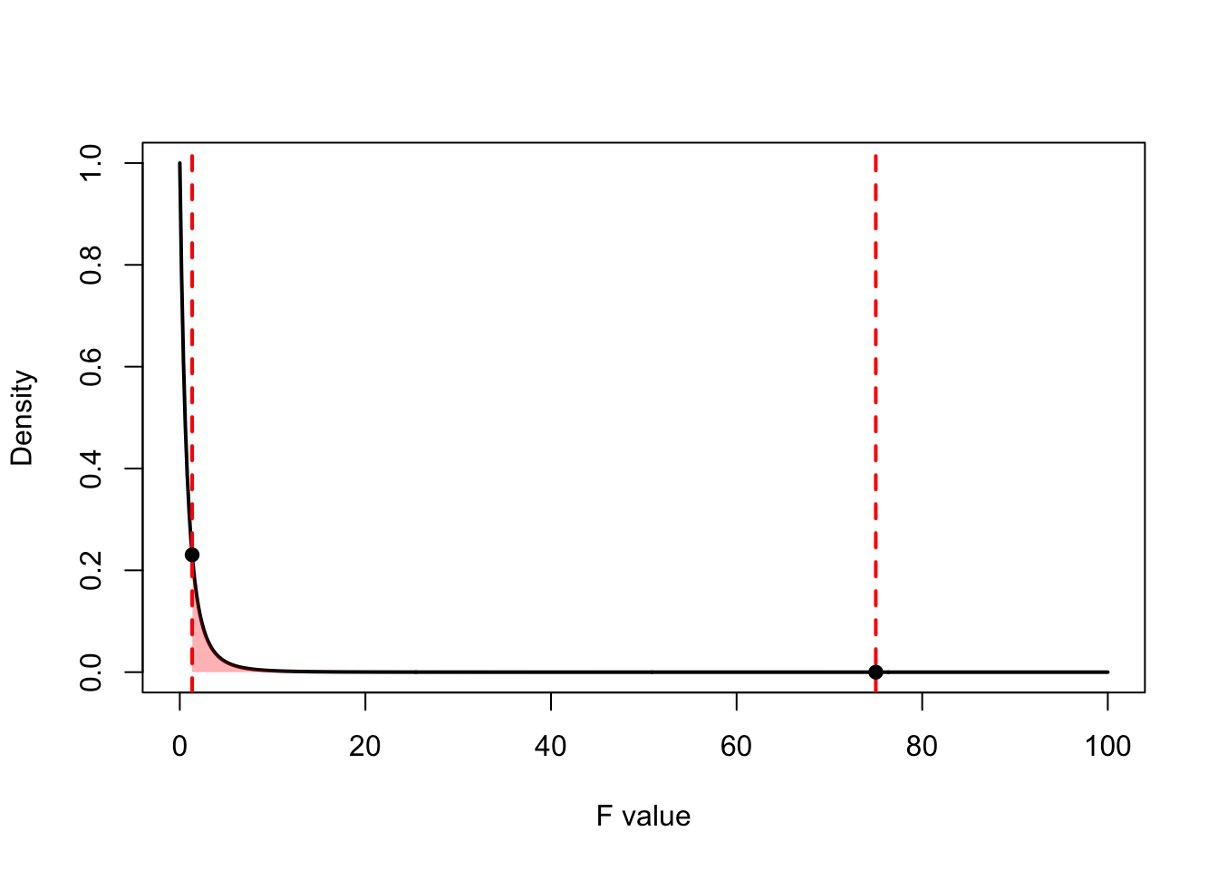
In Experiment 1, \(F = \frac{300}{4} = 75\), which leads to a very small \(p\)-value (\(< 0.001\)). The signal was much larger than the noise, and our data are very unlikely if \(H_0\) were true. So we have good evidence that the treatments differ.
In Experiment 2, \(F = \frac{300}{225} = 1.33\), which leads to a large \(p\)-value (\(0.33\)). Signal and noise were of similar magnitude, and our data are not unlikely if \(H_0\) were true. So we have no evidence against \(H_0\), i.e., no evidence that nitrate extraction differs between species.
How did we get these p-values? This is the same as in any hypothesis test. We have a test statistic and to say something about how likely this test statistic (or more extreme is) under the null hypothesis, we need the null distribution of the test statistic (that is the sampling distribution of the test statistic as if the null hypothesis were true). We then compared the observed value of the test statistic to that null distribution and asked ourselves how unusual it is in light of that distribution. Does our test statistic belong to this null distribution?
The \(F\) test statistic follows an F distribution as specified above.
\[\text{F}^* \sim \text{F}_{(a-1),\;(N-a)}\]
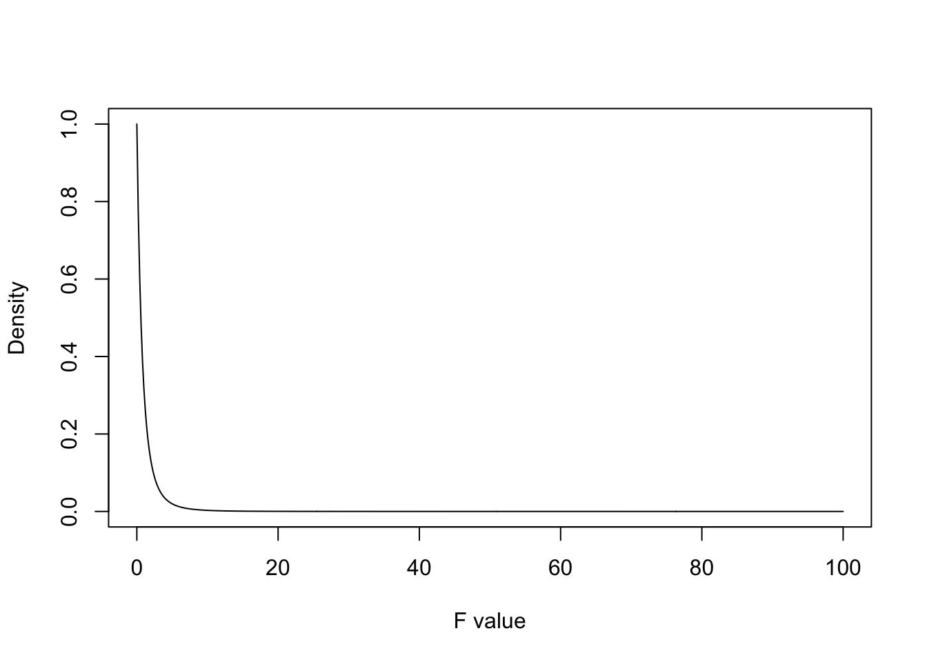
For both experiment, this equates to an F distribution with 2 numerator and 6 denominator degrees of freedom which looks like this:
Code
# Define the range of F-valuesx <-seq(0, 100, length.out =500)y <-df(x, df1 =2, df2 =6)plot(x, y, type="l",xlab="F value", ylab="Density",main="")
We can plot the test statistics on the graph as well and highlight the area under the curve to the right of each of these test statistics:
Code
# Define x valuesx <-seq(0, 100, length.out =500)y <-df(x, df1 =2, df2 =6)# Define test_statstest_stats <-c(75, 1.33)# Plot the F-distribution density curveplot(x, y, type ="l", col ="black", lwd =2,xlab ="F value", ylab ="Density",main ="")# Add vertical lines at test_statsabline(v = test_stats, col ="red", lty =2, lwd =2)# Shade the areas to the right of the test_statspolygon(c(test_stats[1], x[x >= test_stats[1]], max(x)), c(0, y[x >= test_stats[1]], 0), col =rgb(0, 0, 1, 0.3), border =NA)polygon(c(test_stats[2], x[x >= test_stats[2]], max(x)), c(0, y[x >= test_stats[2]], 0), col =rgb(1, 0, 0, 0.3), border =NA)# Add points at the critical valuespoints(test_stats, df(test_stats, df1 =2, df2 =6), pch =19, col ="black")
Remember sampling distributions are probability distributions. For continuous random variables, the area under the curve represents probability. Specifically, the probability of a random variable taking on a specific value or larger, is the area under the curve to the right of that value. For test statistics and their probability distribution, that probability is the p-value. The p-value is the probability of observing a test statistic at least as extreme as we did if the null hypothesis was in fact true. The smaller the p-value, the stronger the evidence against \(H_0\).
We can obtain the p-value in two ways (you will need to be able to do both):
Using Software.
In R, there are several built-in functions for certain probability distributions. These functions typically follow a naming convention:
d<dist>() for density functions
p<dist>() for cumulative probability functions
q<dist>() for quantile functions
r<dist>() for random sampling
For example, when working with the F-distribution, we use:
df(x, df1, df2) for the probability density function (PDF)
pf(x, df1, df2) for the cumulative distribution function (CDF)
qf(p, df1, df2) for quantiles
rf(n, df1, df2) for random sampling
To obtain a p-value, we often use the cumulative probability functions (p<dist>()) with returns \(Pr[X<x]\) so \(Pr[X>x] = 1 - Pr[X<x]\). Below is how to obtain the p-value for the second experiment:
f_statistic <-1.33df1 <-2# Numerator degrees of freedomdf2 <-6# Denominator degrees of freedom# Upper-tail probability (right-tailed test)p_value <-1-pf(f_statistic, df1, df2)p_value
[1] 0.332583
This value is quite large and corresponds to the area to the right of an F value of 1.33 for the distribution above. We interpret this p-value as the test statistic is quite likely to have come from this null distribution, there is a 33% chance of observing this test statistic or more extreme if the null hypothesis is true. We do not have strong evidence against the null hypothesis of equal means.
Caution
A large p-value does not mean that \(H_0\) is true!
The p-value is not the probability that the null hypothesis is true.
The p-value is not the probability that the alternative hypothesis is false.
The p-value is a statement about the relation of the data to the null hypothesis.
The p-value does not indicate the size or biological importance of the observed pattern.
Tip
You can round the p-value if you need to enter the value to a certain number of decimals in a quiz or test using the function round.
Using tables.
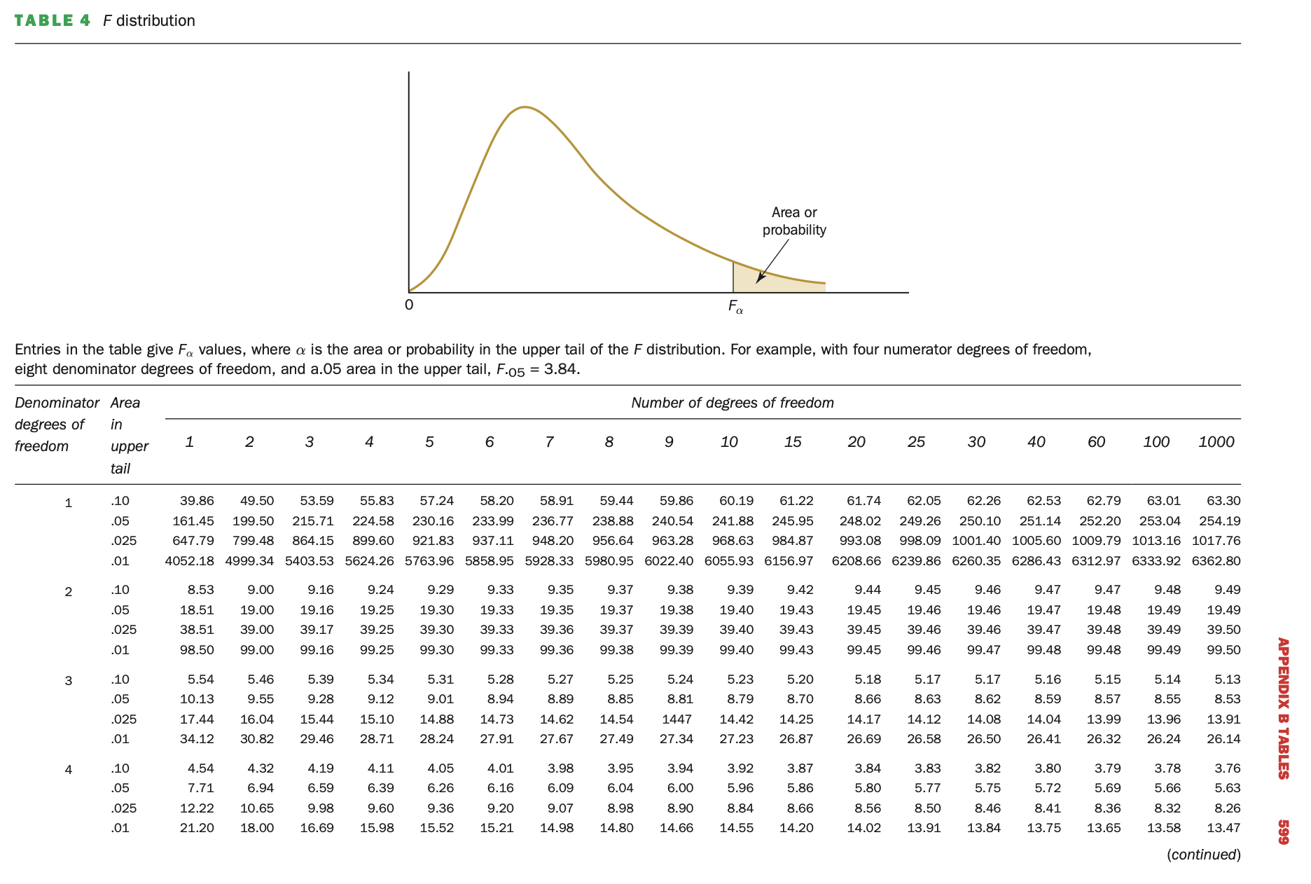
Before the days of widespread programming, statisticians used tables to find critical values and p-values for various probability distributions. These tables were pre-computed for different significance levels (e.g., 0.05, 0.01) and degrees of freedom. In modern statistical analysis, we no longer rely on static tables, as software like R can compute exact probabilities. But since we have written examinations, we have to learn how to do this and it is a useful exercise to make sure you understand what you are doing and not just spitting out a value.
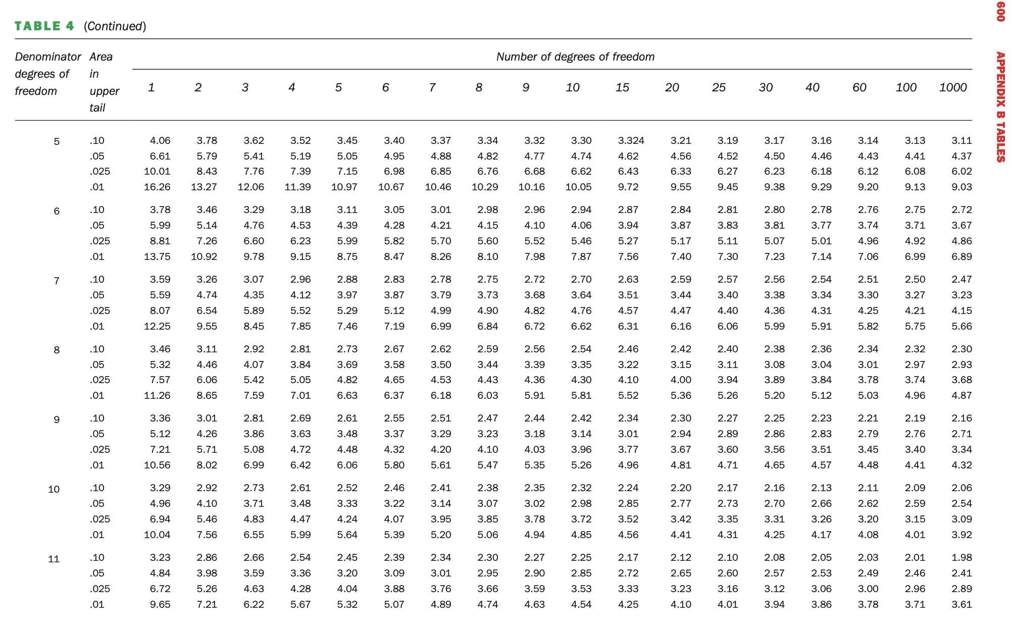
F-tables look like this:
Read it carefully. The table says: “Entries in the table give \(F_\alpha\) values, where \(\alpha\) is the area or probability in the upper tail of the F distribution. For example, with four numerator degrees of freedom, eight denominator degrees of freedom, and 0.05 area in the upper tail, F.05 = 3.84.” This is important, not all tables look like this. See if you can find the F-value mentioned.
The numerator df is in the column and the denominator df is in the row. In the row dimension are different \(\alpha\) values as well. To find an F-value, locate the df in the column and row. Can you find the following:
\(F_{4,4}^{0.05} = 6.39\)
\(F_{10,2}^{0.1} = 9.39\)
\(F_{1,1}^{0.025} = 647.79\)
\(F_{7,3}^{0.01} = 27.67\)
This is how we find critical values of F-distributions. If you are asked to compare a test statistic with a critical value at a specific significance level, you will find the value with a table like this. To find the critical values in R, we use the fq function:
# F4,4 0.05qf(p =0.05, df1 =4, df2 =4, lower.tail =FALSE) # if lower.tail = TRUE which is the default, the critical value with probability 0.05 to the left would be return.
Now, how do we use the tables to obtain p-values? The test statistic for the first Experiment was 1.33 and the df’s were 2 (num) and 6 (denom). If we look at the table above, it only goes to 4 denominator degrees of freedom, so we need the continuation of the table.
Now we locate the F-values with 2 and 6 degrees of freedom and compare the test statistic of the second experiment (1.33) to them. The smallest value is 3.46 where the probability to the right of that value is 0.1. Our test statistic is much smaller than this, so lies further to the right and so logically, the right-hand-side probability of this value with be greater than 0.1. So we conclude that the p-value that our p-value is > 0.1 (which it is, we calculated it to be 0.32). With tables we cannot get exact probabilities, but we can say something about the magnitude of the p-value. Try it for the first experiment which had an F-value of 75.
7.7 Conclusion: Does social media multitasking impact academic performance of students?
Let’s revisit the real experiment we started this section with. I repeat the experiment description below.
Example 5.1
Two researchers from Turkey, Demirbilek and Talan (2018), conducted a study to try and answer this question. Specifically, they examined the impact of social media multitasking during live lectures on students’ academic performance.
A total of 120 undergraduate students were randomly assigned to one of three groups:
Control Group: Students used traditional pen-and-paper note-taking.
Experimental Group 1 (Exp 1): Students engaged in SMS texting during the lecture.
Experimental Group 2 (Exp 2): Students used Facebook during the lecture.
Over a three-week period, participants attended the same lectures on Microsoft Excel. To measure academic performance, a standardised test was administered.
In the previous sections we introduced this study, checked the model assumptions and obtained estimates of the model parameters. Now equipped with that information and all that you have learnt, we are ready to fit to conduct the ANOVA hypothesis test to finally answer our question:
Does social media multitasking impact academic performance of students?
We start with the hypotheses:
\[H_0: \mu_1 = \mu_2 = \ldots = \mu_a\]
In words we say that the average academic performance of students did not differ across the treatments (levels of social media multitasking).
And the alternative hypothesis is the opposite of that:
\[H_A: \text{At least one } \mu_i \text{ is different.}\]
At least one of the social media multitasking treatments resulted in a different mean academic performance, they are not all equal.
We have fit the model already (called m1) and call the summary function to obtain the ANOVA table:
# m1 <- aov(Posttest ~ Group, data = multitask)summary(m1)
             Df Sum Sq Mean Sq F value   Pr(>F)
Group         2  10975    5488   27.42 1.72e-10 ***
Residuals   117  23417     200
---
Signif. codes:  0 '***' 0.001 '**' 0.01 '*' 0.05 '.' 0.1 ' ' 1
Violà! We have our ANOVA table. Inspect the results and make sure you understand how each value is obtained and what they represent. By just looking at the table, you should be able to answer the following questions:
How many treatments were there?
How many observations in total?
Is there evidence for a treatment effect?
The first two you can answer with the degrees of freedom and the third is answered by conducting the hypothesis test. With three treatments, we have 2 treatment degrees of freedom. We had 40 students per group, the sample size is then 120 which means there are 117 degrees of freedom for the residuals. The treatment MS (5488) was much larger that the MSE (200). This leads to an F-ratio of 27.42 with a p-value of \(1.72\times e^{-10}\) (that’s extremely small). We have strong evidence that the treatments did result different academic performances across students At least one treatment resulted in a different mean academic performance. In a report, you would write:
“The manipulation of social media multitasking affected the academic performance of students in this experiment (\(F_{2,117} = 27.42\), \(p=1.72\times e^{-10}\)).”
But which treatments differed? We cannot answer that question with this hypothesis. It only tells us that there is a difference, there is a treatment effect. It does not tell us where the difference or possible differences lie. To determine this, we need to use treatment contrasts. Before we do this or present any results, we need to do one last thing.
7.8 Model Checking
Remember that we said some of our assumptions need to be checked after the model is fitted. Our model specifies the error terms are (1) normally distributed, (2) all with the same variance (homoscedastic), and (3) that they are independent. The residuals are estimates of these error terms and we can therefore use them to check the model assumptions. Normally distributed, equal variance and independent really means that there is no discernible pattern or structure left in the residuals. If there is, then the model has failed to pick up an important structure in the data.3
We call the function plot on our model object. For our purposes we are only going to look at two of the plots and we inspect them one by one by specifying the plot number with the argument which:
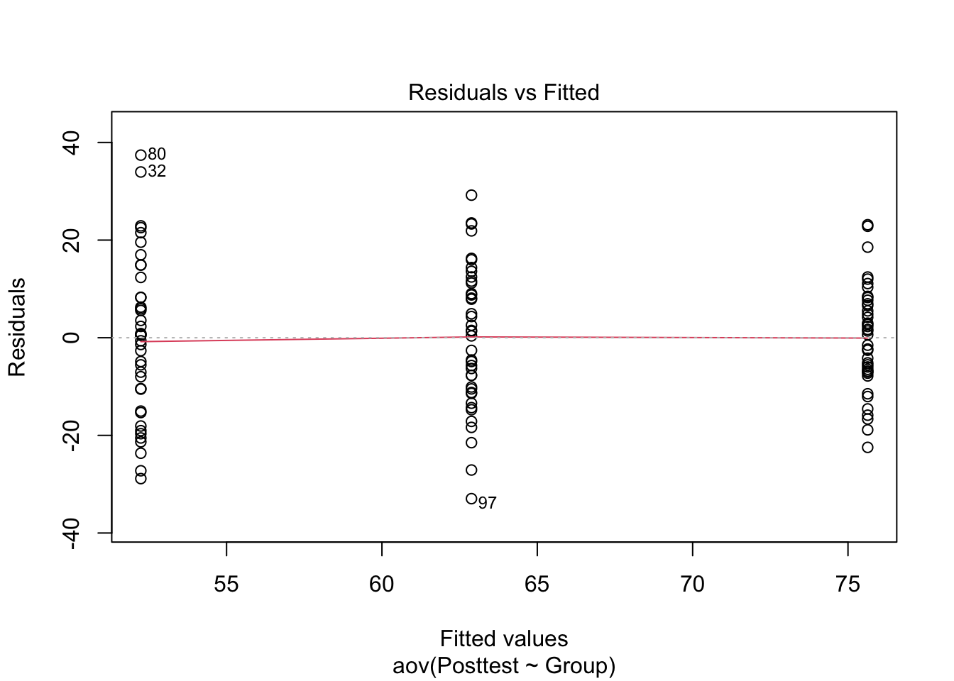
plot(m1, which =1)
This is a plot of the residuals (obs - fitted) against the fitted values and we are hoping to see no patterns. We have three lines, one for each treatment group and we want to check that our residuals are centered around zero and have constant variance across the groups. 4
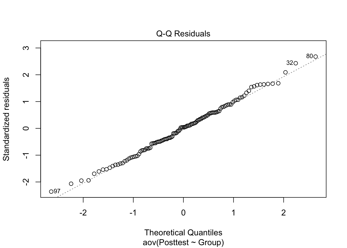
plot(m1, which =2)
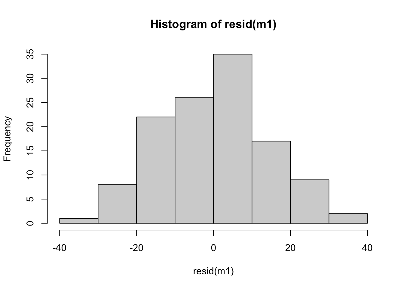
The second plot is a Q-Q plot which we have seen before when we checked the assumption of normality before model fitting. Now, we plot the standardised residuals against the theoretical quantiles of a standard normal distribution. We are looking for the same pattern as before, that the points fall close to the dotted line. As usual, there many be some deviations at the tails but for the most part, there are no serious problems with this plot. If there is some doubt, we can also look at a histogram of the residuals:
hist(resid(m1))
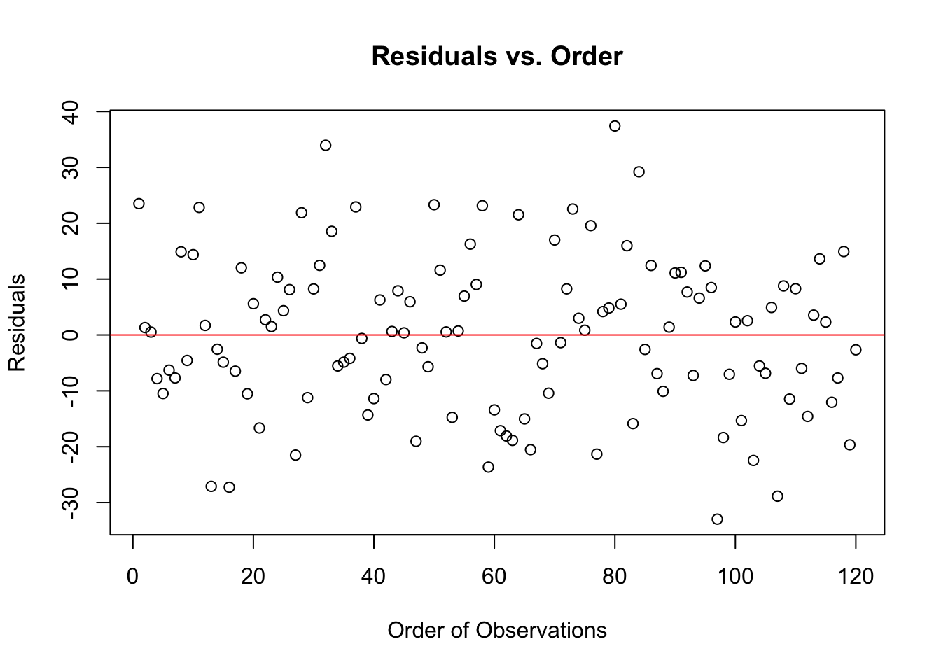
The assumption of independent errors is mostly checked before model fitting and by consideration of the experimental design. If we suspected auto-correlated residuals, we could plot the residuals against order:
plot(resid(m1) ~seq_along(resid(m1)), xlab ="Order of Observations", ylab ="Residuals", main ="Residuals vs. Order")abline(h =0, col ="red")
There are no patterns at all, the residuals appear randomly distributed. So no indications of dependence.
7.9 Summary
That’s a lot. So let’s summarise what we did in this chapter:
We introduced Analysis of Variance (ANOVA), which is fundamentally the same as a regression model with categorical variables but parameterised differently. ANOVA allows us to partition total variance into between-treatment and within-treatment variability, helping us determine whether observed differences in the response variable are due to the treatments and not just sampling error.
We explored ANOVA through a constructed experiment on nitrate removal by plants, demonstrating that variation within treatments influences our ability to detect true treatment effects. The F-ratio, a measure of the signal-to-noise ratio, is central to ANOVA. A large F-ratio suggests that between-group variability is greater than within-group variability, providing evidence that at least one treatment differs.
The F-test determines statistical significance, and its p-value is derived from the F-distribution. A small p-value suggests strong evidence against the null hypothesis (\(H_0\)), indicating at least one group mean differs. The ANOVA table summarises the calculations of the hypothesis test, including sums of squares (SS), degrees of freedom (df), mean squares (MS), and the F-statistic.
Applying ANOVA to real experimental data, we analysed the impact of social media multitasking on student performance. With three treatment groups (control, SMS, Facebook), we found a statistically significant effect (\(F_{2,117} = 27.42\), \(p=1.72\times10^{-10}\)), confirming that at least one treatment influenced academic performance. However, ANOVA does not specify which groups differ and how they differ — this requires post-hoc tests.
Finally, we validated model assumptions:
Normality: Checked via a Q-Q plot and histogram of residuals.
Homoscedasticity (equal variance): Examined using a residuals vs. fitted plot.
Independence: Considered in the experimental design and checked by plotting residuals against observation order.
Demirbilek, Muhammet, and Tarik Talan. 2018. “The Effect of Social Media Multitasking on Classroom Performance.”Active Learning in Higher Education 19 (2): 117–29.
In mathematics, an identity is an equation that is always true, regardless of the values of it’s variables. In other words, the identity is true for all observations.↩︎
 Now we locate the F-values with 2 and 6 degrees of freedom and compare the test statistic of the second experiment (1.33) to them. The smallest value is 3.46 where the probability to the right of that value is 0.1. Our test statistic is much smaller than this, so lies further to the right and so logically, the right-hand-side probability of this value with be greater than 0.1. So we conclude that the p-value that our p-value is > 0.1 (which it is, we calculated it to be 0.32). With tables we cannot get exact probabilities, but we can say something about the magnitude of the p-value. Try it for the first experiment which had an F-value of 75.